With the COVID-19 crisis worsening in America right now, I was curious which areas of the country are being affected more than others? I have been producing loads of SQL over the JHU data set provided by Starschema to the Snowflake Data Marketplace. I thought if I could enhance the JHU data at the county (FIPS) level with population, I could normalize Cases and Deaths per 100k population by County in the United States. Once I had this data in hand, I could produce a map showing a quadrant of counties by Case and Death rates. The quadrant would show counties amongst their peers of Cases and Deaths above and below the mean.
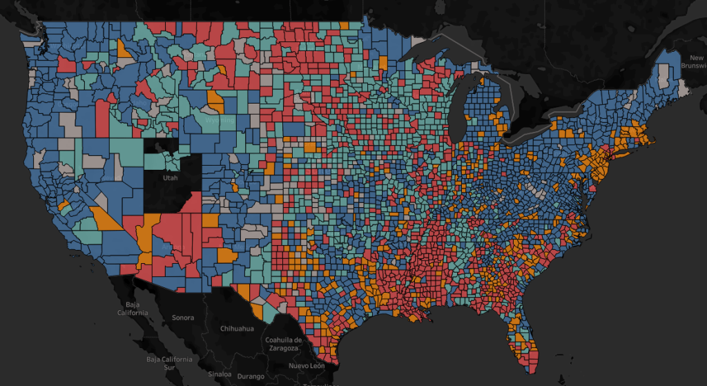
QI (Red – High Deaths, High Cases) | QII (Orange – High Deaths Low Cases)
QIII (Blue – Low Deaths, Low Cases) | QIV (Teal – Low Deaths, High Cases)
“Utah: Utah is reporting county data somewhat differently than many other states. The larger-population counties are reporting confirmed cases and deaths at the county level. However, the smaller counties are banded together into county groups. This is in an effort to protect identities of individuals.”
Starschema’s COVID-19 and SafeGraph’s US Census Data & Neighborhood Insights Data Set
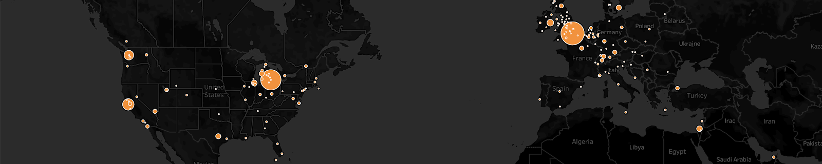
Starschema’s COVID-19 data set (https://starschema.com/covid-19-data-set) and Safegraph’s US Census Data & Neighborhood Insights data set (https://www.safegraph.com/open-census-data) are both on Snowflake’s Data Marketplace. I highly recommend both data sets to drive a deeper understanding of our collective pandemic context. The best part is they are both free to play with, free! I love me some free data…let’s geek out with charts!
Getting and querying data from the Snowflake Data Marketplace is dead simple and built on a very powerful premise. After 3 clicks of the mouse, I have data that is ready for analysis and always in sync with Starschema’s or Safegraph’s latest updates. This means I have instant access to a single-source of truth on COVID-19 cases as reported by public health authorities around the world along with key population metrics to enhance my analysis.
Feel free to play with the finished product here: https://public.tableau.com/views/COVID-19QuadrantMaps/CountyCasesvsDeathRatesMap?:language=en&:display_count=y&publish=yes&:origin=viz_share_link
Getting The Data Sets
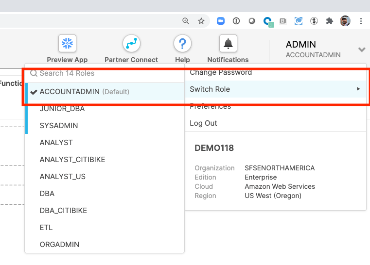
First, you will need a Snowflake account if you want to run these queries. Snowflake offers 30 day free trials (https://signup.snowflake.com/) to get started, even with these powerful datasets. If you have an existing account you must be the ACCOUNTADMIN to follow along. Grab a full copy of the SQL file from GitHub (https://github.com/BigDataDave1/COVIDQuadrant/blob/main/covid_quadrant_map.sql) and the TWB from GitHub (https://github.com/BigDataDave1/COVIDQuadrant/blob/main/COVID-19%20Quadrant%20Maps.twb).
Login to your Snowflake account and switch your context to ACCOUNTADMIN.
Browse to the Data Marketplace.

Get the Starschema COVID-19 set by browsing to the Health category or searching.

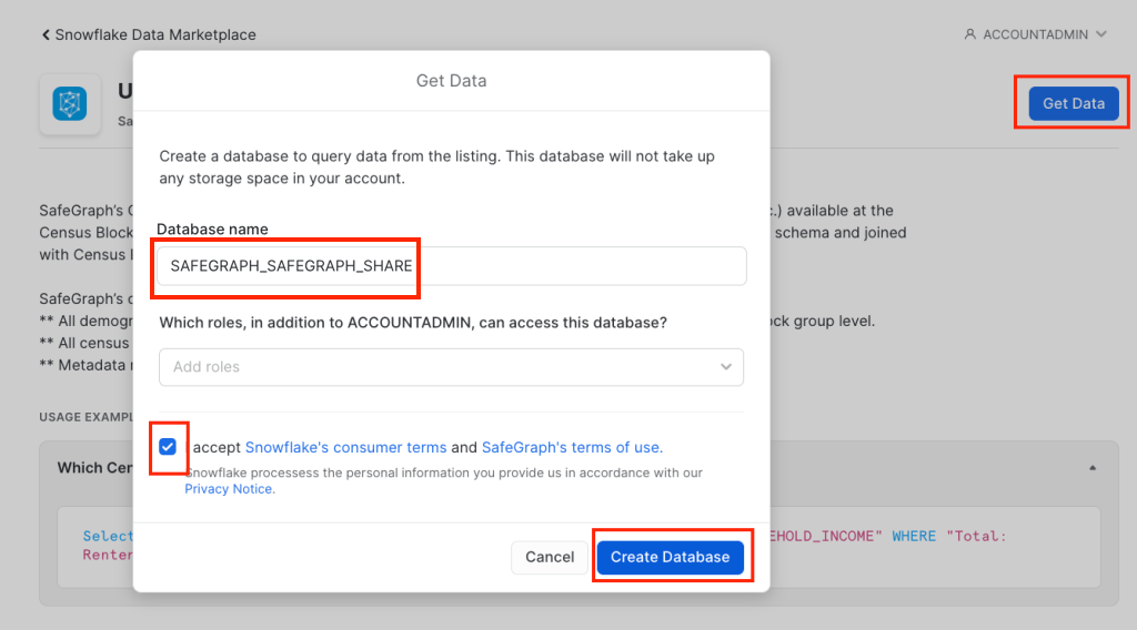
Get the data and assign to roles that need access, keep the name as “STARSCHEMA_COVID19” or the later queries will not work.

Now you are ready to augment the JHU data with county level (FIPS) populations. Thankfully, Safegraph has a free version of their US Census Data & Neighborhood Insights dataset. Get the Safegraph data from the Demographics category, get the database and assign to roles that need access, change the name to “SAFEGRAPH_SAFEGRAPH_SHARE” or the later queries will not work.
SQL Statement Joining the Data
Now that we have both datasets we are going to create a SQL statement to join populations, cases and deaths for analysis in Tableau.
--County Data with Populations, Deaths and Cases
WITH
cases AS (
  SELECT JHU.FIPS, JHU.PROVINCE_STATE, JHU.COUNTY, JHU.DATE,
    GEOSQL.COUNTY_POPULATION,
    SUM(JHU.CASES) AS COUNTY_CASES,
    DIV0(COUNTY_CASES,GEOSQL.COUNTY_POPULATION) AS CASES_PER_CAPITA_COUNTY,
    CASES_PER_CAPITA_COUNTY * 100000 AS CASES_PER_100K
  FROM STARSCHEMA_COVID19.PUBLIC.JHU_COVID_19 JHU
  LEFT JOIN (
    SELECT LEFT(CBG,5) AS FIPS, SUM(GEO.TOTAL_POPULATION) AS COUNTY_POPULATION
    FROM SAFEGRAPH_SAFEGRAPH_SHARE.PUBLIC.US_POPULATION_BY_SEX_GEO GEO GROUP BY FIPS) GEOSQL
    ON GEOSQL.FIPS = JHU.FIPS
  WHERE JHU.COUNTRY_REGION = 'United States'
  AND JHU.DATE = TO_DATE('2020-11-21') AND JHU.CASE_TYPE IN('Confirmed')
  GROUP BY JHU.PROVINCE_STATE, JHU.COUNTY, JHU.FIPS, GEOSQL.COUNTY_POPULATION, JHU.DATE
  ORDER BY JHU.FIPS
),
deaths AS(
  SELECT JHU.FIPS, JHU.PROVINCE_STATE, JHU.COUNTY, JHU.DATE,
    GEOSQL.COUNTY_POPULATION,
    SUM(JHU.CASES) AS COUNTY_DEATHS,
    DIV0(COUNTY_DEATHS,GEOSQL.COUNTY_POPULATION) AS DEATHS_PER_CAPITA_COUNTY,
    DEATHS_PER_CAPITA_COUNTY * 100000 AS DEATHS_PER_100K
  FROM STARSCHEMA_COVID19.PUBLIC.JHU_COVID_19 JHU
  LEFT JOIN (
    SELECT LEFT(CBG,5) AS FIPS, SUM(GEO.TOTAL_POPULATION) AS COUNTY_POPULATION
    FROM SAFEGRAPH_SAFEGRAPH_SHARE.PUBLIC.US_POPULATION_BY_SEX_GEO GEO GROUP BY FIPS) GEOSQL
    ON GEOSQL.FIPS = JHU.FIPS
  WHERE JHU.COUNTRY_REGION = 'United States'
  AND JHU.DATE = TO_DATE('2020-11-21') AND JHU.CASE_TYPE IN('Deaths')
  GROUP BY JHU.PROVINCE_STATE, JHU.COUNTY, JHU.FIPS, GEOSQL.COUNTY_POPULATION, JHU.DATE, JHU.CASE_TYPE
  ORDER BY JHU.FIPS
)
SELECT
  cases.*,
  deaths.COUNTY_DEATHS,
  deaths.DEATHS_PER_CAPITA_COUNTY,
  deaths.DEATHS_PER_100K
FROM cases
LEFT JOIN deaths on cases.FIPS = deaths.FIPS
WHERE cases.COUNTY <> 'unassigned' AND cases.FIPS IS NOT NULL
  AND cases.PROVINCE_STATE IN
    ('Alabama','Alaska','Arizona','Arkansas','California'
    ,'Colorado','Connecticut','Delaware','District of Columbia'
    ,'Florida','Georgia','Hawaii','Idaho','Illinois','Indiana'
    ,'Iowa','Kansas','Kentucky','Louisiana','Maine','Maryland'
    ,'Massachusetts','Michigan','Minnesota','Mississippi','Missouri'
    ,'Montana','Nebraska','Nevada','New Hampshire','New Jersey'
    ,'New Mexico','New York','North Carolina','North Dakota'
    ,'Ohio','Oklahoma','Oregon','Pennsylvania','Rhode Island'
    ,'South Carolina','South Dakota','Tennessee','Texas','Utah'
    ,'Vermont','Virgin Islands','Virginia','Washington'
    ,'West Virginia','Wisconsin','Wyoming');
Time to Open Tableau and Connect to the Data via Custom SQL
TLDR, get the Tableau Parameter ready custom SQL here on GitHub (https://github.com/BigDataDave1/COVIDQuadrant/blob/main/covid_quadrant_map_tableau.sql). Open Tableau and connect to your Snowflake account. Login and navigate to the STARSCHEMA_COVID19 database, PUBLIC schema and drag out a new Custom SQL Statement.

Create a Parameter for “Date to Report” and set it to yesterday.

Insert the Parameter into the two TO_DATE(’21-11-2020′) parts of the WHERE clause in the CTE.
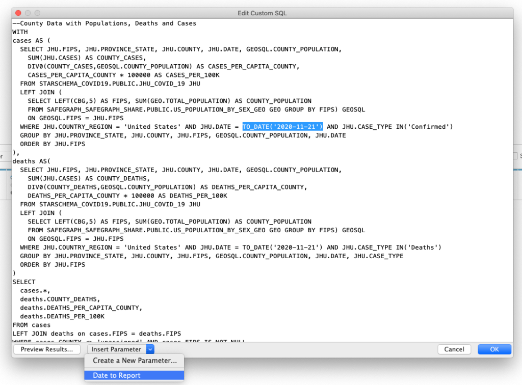
Make sure to do it twice.


Create Map of Cases per 100K by County
I have added one calculation for “County Cases Ratio” as follows “SUM([COUNTY_CASES]) / SUM([COUNTY_POPULATION])”. I created a by County dark map colored by CASES_PER_100K with Tooltips for , COUNTY_POPULATION, COUNTY_CASES and the COUNTY_CASES_RATIO.

I set the color legend up as follows:

Create Map of Deaths per 100K by County
I have added one calculation for “County Death Ratio” as follows “SUM([COUNTY_DEATHS]) / SUM([COUNTY_POPULATION])”. I created a by County dark map colored by DEATHS_PER_100K with Tooltips for , COUNTY_POPULATION, COUNTY_DEATHS and the COUNTY_DEATHS_RATIO.
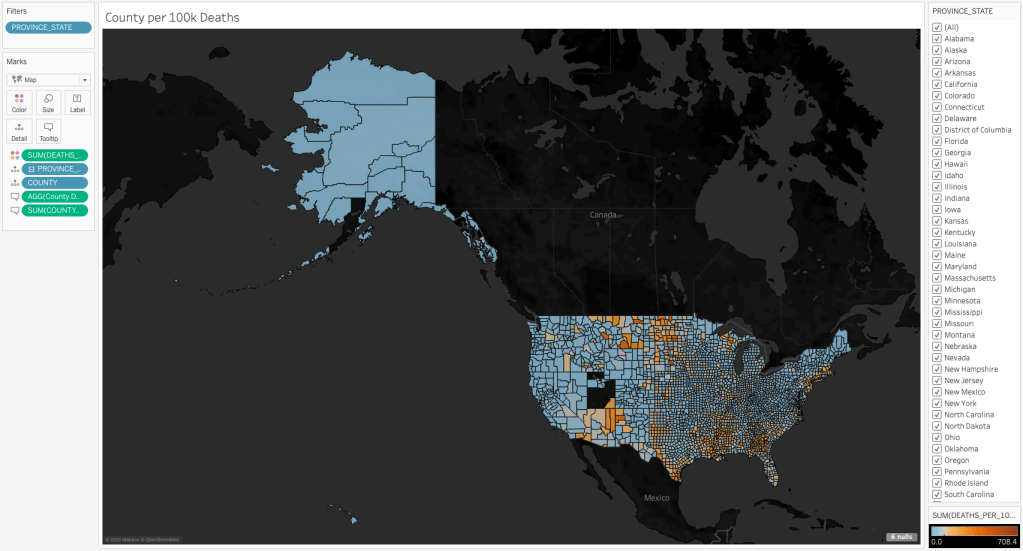
I set the color legend up as follows:

Create Quadrant Chart for Counties
To create the base scatterplot we will add CASES_PER_100K to Columns and DEATHS_PER_100K to Rows. Then COUNTY to Detail and color with 60% and a Grey Border. Finally add a Table Average reference line from the Analytics pane.

To finish our chart out will will need to add 3 calculations as follows.

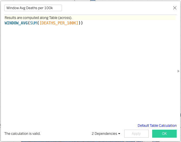
This is my favorite way to calculate quadrant membership. It’s simple and effective and labels the data to the quadrant of membership. When we use the calculation we need to specify how to calculate the windows.
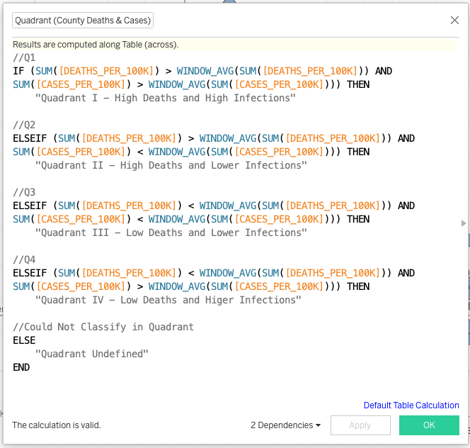
//Quadrant (County Deaths & Cases)

//Q1
IF (SUM([DEATHS_PER_100K]) > WINDOW_AVG(SUM([DEATHS_PER_100K])) AND
SUM([CASES_PER_100K]) > WINDOW_AVG(SUM([CASES_PER_100K]))) THEN
    "Quadrant I - High Deaths and High Infections"

//Q2
ELSEIF (SUM([DEATHS_PER_100K]) > WINDOW_AVG(SUM([DEATHS_PER_100K])) AND
SUM([CASES_PER_100K]) < WINDOW_AVG(SUM([CASES_PER_100K]))) THEN
    "Quadrant II - High Deaths and Lower Infections"

//Q3
ELSEIF (SUM([DEATHS_PER_100K]) < WINDOW_AVG(SUM([DEATHS_PER_100K])) AND
SUM([CASES_PER_100K]) < WINDOW_AVG(SUM([CASES_PER_100K]))) THEN
    "Quadrant III - Low Deaths and Lower Infections"

//Q4
ELSEIF (SUM([DEATHS_PER_100K]) < WINDOW_AVG(SUM([DEATHS_PER_100K])) AND
SUM([CASES_PER_100K]) > WINDOW_AVG(SUM([CASES_PER_100K]))) THEN
    "Quadrant IV - Low Deaths and Higer Infections"

//Could Not Classify in Quadrant
ELSE
    "Quadrant Undefined"
END
Be sure to Edit Table Calculation…and tell Tableau to use Specific Dimensions of State and County for all 3 of these Table Calculations.

I setup my chart to have a filter action on State.

Time to Build Quadrant Map
First, duplicate the quadrant sheet you just built and start modifying by choosing a map from Show Me.

Now change the mark type to filled map and switch the details to tooltip, and switch to color by Quadrant.
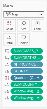
Finally, dark out the map, pin to the lower 48 and show the State Filter.

Conclusion
Building this data set and visualizations was a rewarding analytical experience. I am curious what happens if we add in County level election data? It was easy and powerful to get started doing deeper level COVID analysis with Snowflake and Tableau. Happy (County level COVID) Querying.
Feel free to play with the finished product here: https://public.tableau.com/views/COVID-19QuadrantMaps/CountyCasesvsDeathRatesMap?:language=en&:display_count=y&publish=yes&:origin=viz_share_link

One comment